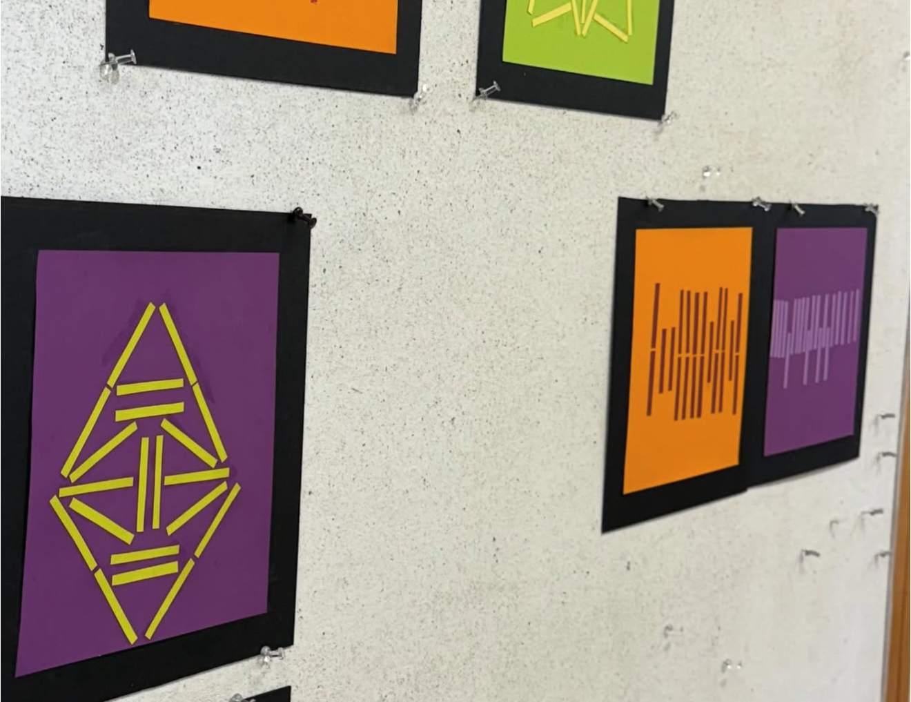
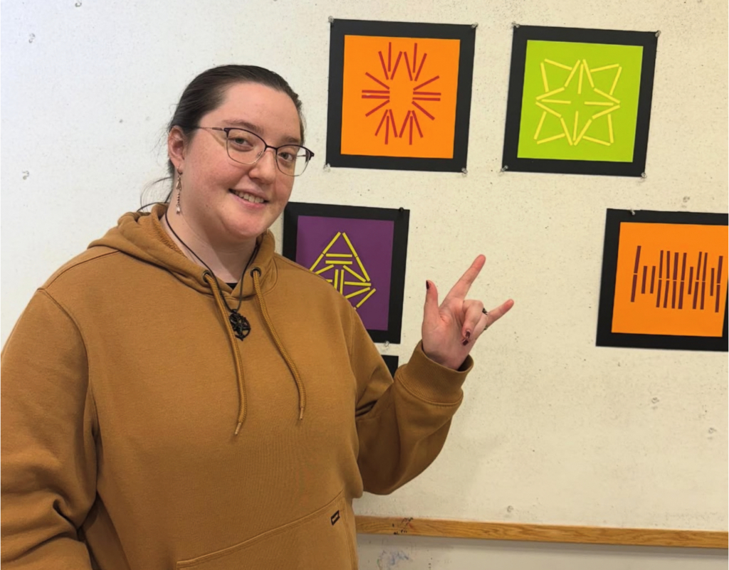
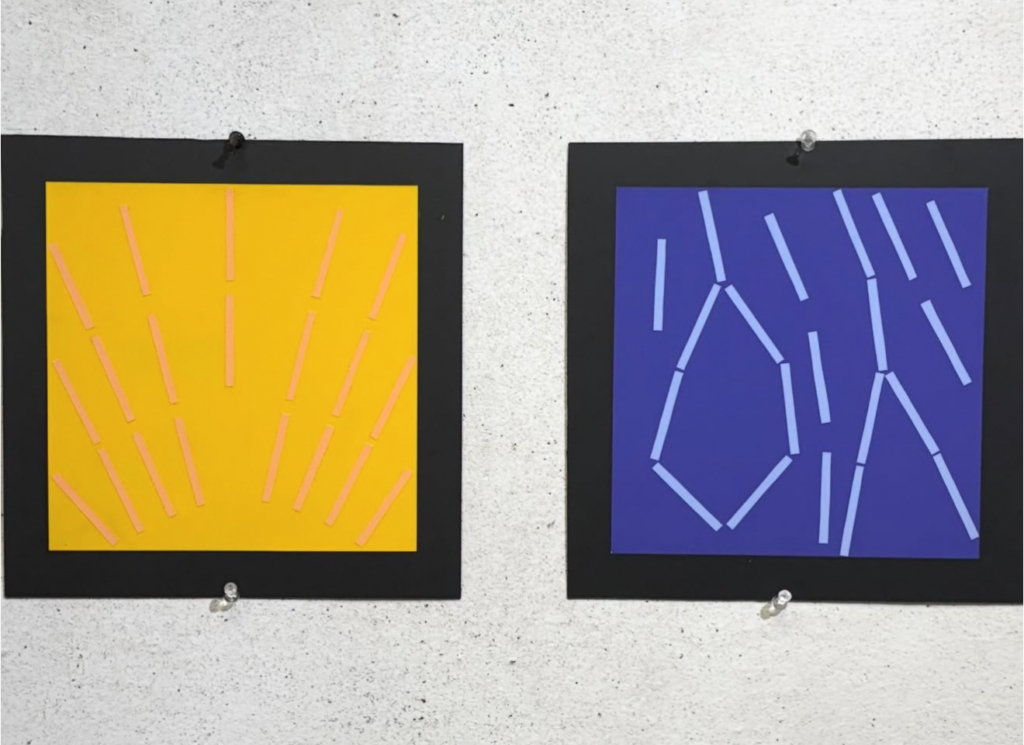
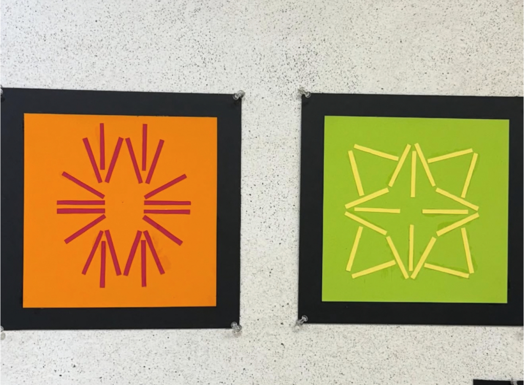
The fundamentals of design are extremely important, and Design 1 helps our students gain a grasp of these concepts through engaging projects. Before beginning to work on their final project, Design 1 students worked on creating artwork using “opposites” such as the words fast & slow or sad & happy. Students needed to convey these words or feelings through imagery made of paint sample strips and color. These get better and better every year! And it’s always good to practice cutting, pasting, and mounting work.





Leave a Reply